
Since movie posters across all genres have the same code and conventions, we have decided to carry out an investigation into a range of posters that promote films
within the horror genre and to search for repeated patterns and
consistent use of conventions. From this, it tells me that in our movie poster, we will have to include the codes and conventions that have been ticked for example having a main image that dominates the poster, the film title at the bottom of the poster, dark/dull colours and a tagline.
It is common that the main image dominates the poster and so this means we should focus on how we would do the main image and make sure it fits the whole poster and also make sure that its stands out to the target audience by making it quite grotesque and scary. Dark colours must be included, it gives more of a scare to the audience and from my overview we clearly see that all of them have got this feature. Film title must be include and usually placed at the bottom of the poster, this is to make the audience focus on the main image and then see the film title, this is to add more suspense since the audience would want to know what it is called so that they can go watch it in cinemas. Not all of the posters that I analysed had the release date added on, they either say coming soon or they don't have one on it. This is because they are generally added at the end of movie trailers and a poster is meant to encourage the audience to go see the trailer. The producers and actors are usually added at the bottom of the poster since its not very important, since actors that play in horror movies are not popular due to the fact that if they were famous it would be less believable if that character was to die and so when we do not recognise the actor, we see the character more as a ‘normal’ person and can relate to them more and so a) we see the film as more real/actually happening b) we think this event is more likely to happen to us too. This is the reason why they add producers which have created other top quality movies which the target audience would have already watched and so they would then go and watch the movie. Even though only two film posters got full ticks on all the codes and conventions, all these film posters follow the majority of the typical codes and conventions of horror. This makes it easier for the target audience to identify which genre and sub-genre the movie is from and so these posters that I over-viewed have done so successfully.
A tagline is a real vital element to the movie poster. The tagline usually relates to the film title and the main image to create a link between them all. This also enhances the narrative and gives us and idea of what the story should be. Generally its either the victim/ main character OR the possessed demonic spirit that attacks the main character, this is to either show us the horror in their eyes of the main character or how creepy and scary the demonic spirit or child is. This is a strong element that should be used in our poster, this is to either inform the target audience that its scary and horrific through the victim or to see the spookiness and creeps through the killer.

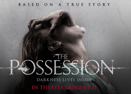
The mise-en-scene of these posters always tend to be very distorted, misty and gradient like which creates a ghostly look and feeling. As you can see from the posters above, they all have dull colours that range from dark blue, to green and mostly, grey and black. The typical iconography that appears on these posters is the distorted font which is generally serif font and this links with the olden days as for possessions are usually originated from the past. The cracks in the walls and the spooky images like the shadow of a "ghost" in the grave encounters poster, the hand coming out of the mouth in the possession and also the child in the reflection in the unborn poster are typical iconography that appears in supernatural sub-genre, the shot type is usually either a long shot to show the whole image and the background or a medium close up to see the emotions and the unusual images that tends to appear on the poster.
Expanding on the font style, Grave encounters is in san serif font as for its a movie which has been recently released and so the typical modern font is generally san serif. Also grave encounters is a found footage type of movie and so the font reflects the movie narrative. Majority of the posters that I over viewed either has one effective word for the title or 2 words. They are generally placed at the bottom in big upper case font. This is to let the audience get drawn in by the main image and then focus on the title as then it will become memorable. The words used are linked with the supernatural genre, and spooky death like words such as "grave" "possession and "The Unborn". They all sound mysterious and freaky and so this will interest and hint to the audience what this movie is about. The tagline links with the font by using the same style, with the image as it reflects what the movie is about and also it reflects the title of the movie. Tag lines are used to make the movie memorable to the audience and so when they hear it they remember the movie and what it is about. Taglines are used to generate fear and a small hint which allows the audience to figure out by linking the posters elements together. An example of this is where on the "The Possession" poster it says "the darkness lives inside" and also its clear to understand that the possession means trapped and locked up. Also from the image we see a link that something is trying to come out of the woman's mouth and so we automatically know that it is the darkness.
Having No
date of release also increases intrigue, makes the audience go have to find
out independently or look out for it on future posters; this makes them
inevitably more interested in the film and its promotional material. The institutional information is usually written in dark or light grey or white. This is to bounce off the main image of the poster and so it stands out. They have done it in a clever way in which they would make the well known producers and studios bigger than the rest so that the audience's eye goes to them and read it first. It is placed at the bottom of the poster since it is the least important piece of information.
No comments:
Post a Comment