My
A2 task was to create a promotional media package which promoted a horror
movie. This included a Movie magazine, a poster and trailer all from scratch.
To achieve the highest rate of standard, we encountered a range of research and
planning to make professional media texts. In this evaluation I will talk about
what we achieved and how we strived to accomplish it.
When I was set the task to create a promotional package for
a horror movie I knew that it required a lot of research in the typical codes
and conventions to create a professional promotional package. Since I have been
a media student for a number of years, I knew that the codes and conventions
are one of the most important elements and a focus point that should be taking
into account when creating a piece of media text. By researching current horror movie
trailers, posters and movie magazines, I was able to collect a range of codes
and conventions for each task and either duplicate or challenge them to create
repeated features that are displayed on current horror media texts. This is a
way of making a clear identification for our target audience of what our media
texts are trying to represent.
To achieve the appropriate codes and conventions for horror,
I set myself the task to research current trailers, posters and movie magazines
which promote horror. As a group, we decided to focus on the sub-genre of
supernatural and so it was easier to identify the most appealing codes and
conventions that relate to that sub-genre.
By using genre and sub-genre we were able to point out the specific conventions which helped us draw in our target audience and fulfil their exceptions. This was done by seeing an overview of the horror genre then comparing each sub-genre. A famous media theorist named Jacques Derrida says that "signs" in media texts are polysemic and that the audience will interpret them in different ways depending on their own experiences. Since our target audience are horror fans, they have past experiences of the supernatural sub-genre which means they would be able to identify certain elements and conventions which will allow them to understand what genre we are trying to promote to them. This theory was proven to us by our questionnaire that we first done at the start of our research.
For horror movie trailers they continuously have features
that crop up such as dark lighting, screams, eerie music, a sting and a
narrative which shows the equilibrium, the disruption then reaction but never
the repair or new equilibrium. Supernatural horror movies like "Grave Encounters", "Paranormal Activity", "The Devil Insde" and "The Unborn" all have codes and conventions that are repeated. These included Dark lighting to create a dim mood, intensified use of diegetic sound to add tension and finally a sting to leave the audience feeling very shocked and feared by it. These conventions create the effect of tension and suspense since they don't know what is going to happen and so by using these conventions it reflects the mood of the sub genre which makes the audience rather anxious to go watch the movie. This is a smart tactic to do because it leaves the
target audience in suspense and completely anxious to know what happens next
resulting them in going to watch the movie. We decided to use these main
conventions so that we create a common but new horror trailer which will look
professional at a high quality standard. Using a sting is generally a way of
leaving the target audience in fear by presenting them with a couple of seconds
shot which generally displays a terrifying scene. We obeyed the rule of
including a sting as for it gives the trailer that final touch for it to seem
more petrifying and more professional. We also decided to use a certain
locations like hospitals, isolated homes, and long corridors to create a
“trapped” feeling to seem as there is no escape from the antagonist. By
watching other supernatural horror trailers, the antagonist is generally either
an old lady or a young child who has a possession due to either a curse or
demonic spirits and so we decided to base our narrative on a possessed old lady
which was mistaken to be mentally ill. The characters chosen for our trailer
were also conventional since we used white characters that have natural beauty
and also have the sense of confidence. Dark lighting creates a dull and gloomy
feel to the trailer which reflects to the genre and so we decided to promote
this a lot in our trailer to give it a more chilling feeling. One main element
in a trailer is the sound features and effects which are played in the
background to enhance a certain scene. We looked through current trailers,
horror console games, and YouTube sound effects that would work well for our
trailer. We used a range of bangs, tensional and eerie music to emphasis a
scene making it more fearful that alerts the target audience on what is going
on.
At 2:11
At 1:42
The timing at 1:42 influenced our trailer. As a group we went through many trailers to find a frightening scene which we would use for our sting as for our original plan didn't go so well when we were filming it and so a change was needed. We came across "The Last Exorcism" trailer and we felt that we should duplicate the same scene at 1:42 of having our antagonist crawling towards us upside down. The upside down shot makes the audience feel unsafe since it gives the sense of supernatural movement and the fact that the antagonist might even be on top of them. We tested this shot and used it as the sting because it delivered a frightening suspensional shock.
For our ancillary tasks, the horror poster and the movie
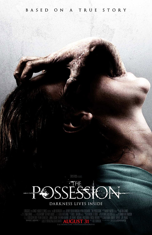
front cover magazine almost have similar codes and conventions. During research and planning we analysed a couple of movie posters and magazines to help us pick point out the most effective conventions. For posters, I focused on "The Possession", "Drag me to hell" and "The devil inside". These are all supernatural horror movies so learning the conventions that they use and applying them to my work would be a good idea since they are highly successful. The main conventions that they all tend to focus on Dark/dull colours or a semi light background to contrast against a dark,evil main image. The main image is generally of the antagonist or the protagonists reaction shot. Tagline is added to give a slight hint of the narrative and of course the title of the movie towards the bottom of the page. These draw the audience in because they are effective ways of making the poster more understandable. Having the dark lighting and a scratched out background, creates the feeling of someone being trapped and as if they are trying to escape. Overall these conventions are effective because once they are all in place they compliment each other and they make the poster more understandable. Movie magazines are not as popular so I focused on analysing 2 of the most successful ones. Total Film and Empire have certain conventions to gain the audience's attention. They tend on focusing the page all on the main image and keeping the amount of text on the front page really limited. Big bold font with primary colours are also one of the most common conventions that appear on a magazine, it stands out the most to the audience since they are generally males. Also male audience tend to respond a lot to visual things and so they have created the front cover to fulfil their interests.
For our year 12 coursework, we learnt about the typical codes and conventions for the magazine which means my knowledge was extremely high and I had strong idea of what codes and conventions are the most appealing to our target audience and what special effects are used to create a professional magazine and front page cover. For our magazine front cover we used a range of conventions such as a puff, having a specialized layout, a main image which is from a still from a movie or the same image from the movie poster, having a tagline, sell lines and a banner. An example of a typical code and convention was our main image. Since we are aiming to promote horror, we used a haunting image of the antagonist that would be featured in our trailer. This was done because it would draw in the audience since they are receiving and taking in what is linked with the image such as the magazines main sell line "Halloween Special". Sophisticated yet young like mode of address was used so that the audience feel a connection with the magazine. Phrases like "...The box office by storm" is exaggerated in a way that would stand out to the audience since it emphasise how effective our movie is. The effects we used such as drop shadow, gradient overlay, outer glow made certain elements shine out from the page creating a 3D effect.
For our year 12 coursework, we learnt about the typical codes and conventions for the magazine which means my knowledge was extremely high and I had strong idea of what codes and conventions are the most appealing to our target audience and what special effects are used to create a professional magazine and front page cover. For our magazine front cover we used a range of conventions such as a puff, having a specialized layout, a main image which is from a still from a movie or the same image from the movie poster, having a tagline, sell lines and a banner. An example of a typical code and convention was our main image. Since we are aiming to promote horror, we used a haunting image of the antagonist that would be featured in our trailer. This was done because it would draw in the audience since they are receiving and taking in what is linked with the image such as the magazines main sell line "Halloween Special". Sophisticated yet young like mode of address was used so that the audience feel a connection with the magazine. Phrases like "...The box office by storm" is exaggerated in a way that would stand out to the audience since it emphasise how effective our movie is. The effects we used such as drop shadow, gradient overlay, outer glow made certain elements shine out from the page creating a 3D effect.
All these codes and conventions which we used were inspired by existing movie
magazines such as Total Film and Empire. These are the most popular and the most successful magazines which have gotten over 873,000 reader ship and so by following their codes and conventions, we knew that we could be just as successful. We decided to use a certain mode of address which will relate to the audience and encourage them to read the magazine. From our magazine and Sherlock Holmes Empire magazine, you can see we used a range of codes and conventions and layout skills such as the masthead being behind the main image, a puff, a banner, a plus sign to display the sell lines and inform the target audience what is included in our magazine.


For our movie poster, we decided to use the emblematic layout in portrait view. We placed the slogan/tagline at the top saying “based on true events” as for it stands out against the light background. This would draw in the audience since it gives the vibe of realism. Psychophysically the audience would be tricked believing that the movie is actually real and so this creates the feel of anxiousness of what the movie is about and maybe it could happen to them. Placing the institutional information on the bottom of the poster makes it less eye catching and interrupting on the rest of the poster, title and main image. The main image being so horrific was a great success for making a professional movie poster. A chilling main image is generally the first element that the target audience will aim to look at to decide if they would want to watch the movie or not.Our main poster fulfils full expectations for our audience by promoting the chilling feeling. Having our antagonist looking at the mirror normally then her reflection being distorted, it provides the audience fear and anxiousness of why she is like this. It is similar to other existing supernatural movie posters by using a haunting image that gives a slight insight of the narrative. The layout and the tagline used also signified to the audience that there is a demonic spirit linking to our narrative and as supernatural fans, our audience would know that supernatural links with curses, demonic spirits and possessions. We were capable of previewing the narrative of the movie to the target audience through the title, the slogan and the main image. For our poster, we were highly inspired by "The possession" poster. Being horror movie fans, we acknowledged and were drawn to that poster the most out of current ones and so we felt as in we needed to produce a similar media text that will be able to catch our audience attention.

Imagination
and designs are always improved from inspirations. Obviously we can’t copy a name,
images certain logos due to plagiarism, so the only way for us to create an
effective poster and magazine is by changing and challenging certain codes and
conventions. In our trailer, we decide to challenge the idea of having many
screams in our horror movie to about one scream. We decided to do this because
we felt like out footage delivered enough fear and also the use of tensional
music makes up for the lack of screams. The sting that we used was inspired by “the
last exorcism”. We watched many trailers and analysed them to full detail and
we felt like that that certain scene caused a lot of horror which we want to
promote in our trailer. For our ancillary tasks, we felt like we should keep it
really common and not challenge any conventions so that the target audience
don’t miss-understand what we are trying to promote. We thought to be creative and base our movie magazine as a halloween special since there is not many horror movie magazines for us to base the general codes and conventions. By having a halloween special edition, it allowed us to challenge and play with some off the conventions such as a pumpkin for the puff. Also, our movie trailer was planned to come during October which of-course reflects the halloween season.
This GIF previews some of our codes and conventions which we have used on our poster.
_____
Creating three promotional media texts to promote one movie was a task which I thrived to challenge. Having the opportunity to be working in a group, I can personally say that each media text that we produced was highly successful due to the fact that we had a range of opinions and criticism on our own work which lead up to improving the three media texts to a high professional piece.
When we started creating our movie poster, we decided to show our audience who the antagonist instead of our victim since we aimed at creating a supernatural movie which is either a possession or ghostly spirits. We came to this decision because we felt as if we wouldn't be able to create an effective reaction shot from our protagonist that will make the audience feel scared. I feel that our main image was one of the most effective ways to help us promote and get across what we are trying to tell our audience. The main image featured the antagonist looking normally at the mirror, but her reflection is her looking demented and possessed. We managed to successfully promote the feeling that she was possessed by her eyes widened and blacked out and her mouth stretched to an extend that a normal human wouldn't be able to do. Having “ based on a true events” placed at the top of our poster helps us promote that a real life event has happened and so with it linking with our main image and title, it helps the audience understand that we are promoting a horror movie that is chilling and blood curdling During the creation of our poster, we had our peers telling us how amazing it looks and they would go watch the movie, this gave us the confidence that it is highly successful at promoting the film since they are all fans of horror movies.
After analysing movie magazines, we have realised that all the main images were the same image from the poster so we decided to duplicate this idea to create the same effect towards the audience. Sell lines and small images are one of the most eye catching elements on a poster and of course the title of the movie. We thought we would challenge this convention of having our movie title in bold letters but mentioning that it’s a Halloween special. Doing this helps us promote the horror movie because horror and Halloween link in a way in which our target audience would crave to go watch a horror movie to feel the rush of Halloween. By doing this, it shows originality to our magazine and also a sense of creativity, this makes me optimistic about our movie magazine being successful. By adding other elements like puffs, a banner and a strap line, it presented the audience a professional feel since they generally occur in other movie magazines. Since they are used to seeing these features on other magazines they would believe that the magazine is official and so this makes it an effective movie magazine.
A trailer for a movie is probably the most efficient way of promotion. The generation we live in are surrounded by technology and so trailers are everywhere we go, from TVs, to our mobile phones. A trailer gives the audience a little hint of what the narrative is and helps them identify what genre the movie is. I personally can say that our horror movie trailer would be successful because it gives and shows the common codes and conventions that are generally needed to promote horror. An example of this is a fast montage that would get the audiences blood pumping, a frightening sting which would leave the audience absolute shock , dark dim lighting made the trailer more effective since it portraits darkness and that links with fear since the audience cannot see anything in the dark making the scene more frightening and full of suspense. A ghostly antagonist that explains to the audience what the narrative is all about, and most importantly short cut edits the tensional eerie music that make the scene more dramatic and full of tension. These elements make the trailer successful due to the fact it helps delivers the narrative to our audience and also it makes them feel as if they are within the movie. Our trailer did have many issues when making it due to software and certain scenes not working, but through determination and perseverance we managed to change it for the better and improve it in a way which makes it relate more to the target audience.
As a combination of our three media texts, I believe that our promotional package is very successful and effective. I feel this towards our promotional package due to the fact of us following codes and conventions, we remained a certain theme, and we used common lighting, colours, special effects, locations and also the most important element that links them all together, brand identity. As a whole of our promotional package, our three media texts compliment each other because they all have a symbolic link within them. Our Main image has been repeated twice on the magazine front cover and also the movie poster, we also see the same antagonist wearing the same costume in the trailer which makes it clear to the audience that she is the antagonist and the one who is after the young daughter. At the end of the trailer, we have inserted a strap that includes the title and tagline of the film and again is repeated on the poster. By having a symbolic link, our audience would be able to identity the link between the three pieces and so it becomes memorable causing them to discuss it with other friends helping us to promote the movie. This is a way of keeping a high promotion rate since the audience will end up looking for the media texts because they are so effective.
Overall, I feel that we have managed to make our target audience feel connected and able appeal to our promotional package. Our promotional package would be effective for and appealing for a fan of supernatural horror because we researched certain elements which our target audience specified that is effective. In our feedback we had a range of ideas on how to appeal to our audience and from that we applied it to our promotional package which will attract our audience. For our magazine front cover, the mode of address that we used and by mentioning their interests appeal to our target audience and so this will attract them to read the magazine. We used phrases like “Frame by frame break down” & “...To hit the box office by storm”. These examples relate to our audience because conversation with their friends like this and by creating this, the target audience will feel a special connection with the magazine. For our poster we used an effective main image and a short snappy tagline “based on true events”. Our target audience are teenage males with a small amount of females that love horror, by mentioning based on true events; it will give them the slight assurance that this movie could be real which could result in them going to watch the movie. From our research and planning, we done a questionnaire and a focus group to help us see what our target audience want to see on a movie poster and what attracts them to go watch it. We completed this task by showing them other existing posters and seeing both their benefits and bad points, this helped us determine what elements and effects were needed to appeal and attract our audience. For our trailer I can personally say that the sound plays a massive part in attracting our target audience. I fit into our target audience criteria and as a fan of horror movies, the sound effect and sting made me more excited and anxious to go watch the movie. During our making of our trailer we talked to a range of people and they all mentioned that the sound effects is the important part. We enhanced certain scenes with these effects to create a more dramatic scene and so this left the audience feeling really anxious and on edge. This makes me sure that our trailer appeals well to our audience.
____________
The target audience that we aim our promotional production
is mostly male dominant from the age 15-30. Our target audience have different
occupations but highly educated and intelligent. They are outgoing, active, internet
savvy and they love having a cosy night in watching movies or just relaxing
with a couple of friends. They classify horror movies as one of their favourite
movie genre as for it delivers an adrenaline rush which they enjoy experiencing.
For our ancillary tasks, we decided to repeat the online
survey because it relates to our target audiences everyday lives of using technical
equipment, it’s easier to capture the data, more organized and simpler for both
us and our target audience. It previewed our movie poster and magazine cover with
following questions that helped us determines if our ancillary tasks were successful
or not. We asked 15 people, 8 males and 7 females since we realised that our
horror movie appealed a lot to females also and we felt as If females responded
well towards our promotional ancillary tasks as much as males did. For our
trailer feedback, we thought we would be more direct and ask four individuals to
watch our trailer and then record their responses towards our trailer.
An example of some of our feedback is the focus group that we created and is previewed below:

For each task, we received a high rate of positivity which
meant we fulfilled our target audiences requirements and expectations. Our
movie poster was said to be one of the most effective and most professional media
text which helped raise the promotion of this movie. Our target audience gave
us a positive response with many saying that the main image was the most
effective since it gives them a real chilling feeling. From researching current horror posters, we handpicked
the most efficient elements that would grab our target audience’s attention
such as using the same layout as “The possession”, having a chilling image and
telling the narrative through our title and slogan. The only thing that was said to
be changed was the lightness of the title. The fact that its plain white, makes
it stand out too much against the background and main image and so it portraits
a pure image which slightly put off the audience. We could change this by either
adding a crackled design on top of the title or by applying a darker shade of
white for the title. By getting such positive response on one media piece, it gave
us a confidence boost that we have created something that appeals well to our
target audience.
In terms of our movie
magazine, our target audience provided us with great feedback once again. We
were able to promote that our movie is a horror supernatural from again the
main image, the name and the one extra element on our magazine “Halloween
Special”. By having this Halloween special on our magazine we played it safe
instead of creating a horror movie magazine which not much audience around the
world read, and so by having it as a typical movie magazine it will expand to a
range of audience who might not particularly like the genre. The sell lines we
used appealed to our audience in a way in which they have something they would
enjoy to read, this also received a positive response. The only negative
comments that we received was about the masthead, they mentioned that it was
too dark and did not stand out. Some said they didn’t even realise it and it should
have been on top of the main image. Some mentioned that we had a lot of sell
lines for a movie magazine but they didn’t mind it, this is a convention which
we challenged and succeeded well.

Finishing our trailer and going back and improving it over
and over proved to us that it was worth all the effort. We thought we would
take our experience of using the camera to record four of our target audience
to get all their reactions and opinions about our trailer. They all thought
that the trailer was highly effective in a way in which it tells the audience
the narrative really briefly but enough to be understood and they felt as if
there was a good build-up of tension which leads to the fast montage and the
sting. Our trailer managed to deliver the recognition of it belonging to the
genre of horror and the subgenre of supernatural. They mentioned that the
actions of the antagonist made it clear to them that she had a possession. They felt as if we followed the general codes
and conventions of a horror movie trailer well when it came to lighting,
mise-en-scene, hair, makeup and costume. They mentioned that the fast montage
was the most effective section in our trailer essentially because it was
exciting, heart pumping and high with tension. They stated that the sound of
the trailer enhanced many scenes of the movie and it created a lot of tension.
Also the music and soundtrack reflected the lighting because it was dark and
dim which made them feel as if they are in the movie themselves. The only issue
that was noticed by our target audience was the fact that the start of the
trailer was really slow and didn’t have much of a excitement but once it hit to
about half of the trailer, they said it made up for the start and it works
well.
I feel that I learnt a lot from the audience feedback as for it made me improve my work in such a way in which the audience would be happy with out final promotional package. By asking them a range questions that relate to our package helped us stay organized and able to understand what they most appeal to making it easier for us to film and plan what was needed. Overall, our fast montage was praised in a way in which it made the trailer very successful and the improvements we can consider is making the start more interesting and frightening so it doesn’t drag out a lot and produce that slow feel. I felt that as a group we succeeded well on achieving what our target audience want to see and also we created three professional media texts that have appealed to our target audience.
I feel that I learnt a lot from the audience feedback as for it made me improve my work in such a way in which the audience would be happy with out final promotional package. By asking them a range questions that relate to our package helped us stay organized and able to understand what they most appeal to making it easier for us to film and plan what was needed. Overall, our fast montage was praised in a way in which it made the trailer very successful and the improvements we can consider is making the start more interesting and frightening so it doesn’t drag out a lot and produce that slow feel. I felt that as a group we succeeded well on achieving what our target audience want to see and also we created three professional media texts that have appealed to our target audience.
______
Throughout
this project, using media technology was highly essential to create a
multimedia blog and promotional package. Firstly we started using media
technology during the research and planning stage to enhance our research and
also be able to get a range of information. The internet was one of our main
resources to help us. Google and IMDB were the first ones we used since they
provided us with the information we needed about learning and analysing movies.
IMDB is a site which lists every movie ever produced listing us the cast, the
genre, the synopsis and some images. The internet gave us the freedom to go through every little detail that would help us improve our product. This helped us in a form where we managed
to find horror supernatural movies really fast and very simply. When it came to
the stage of analysing, YouTube was extremely helpful as for it let me expand
my imagination by allowing me to watch a range of trailers, real life case
studies and even past media coursework. A way in which it helped us train for our filming was by doing a range of
focus groups that involved us filming what was going on this helped us learn
how to use the camcorder so we don’t waste time when it came to the filming. It
made our blog look more modern and sleek which of course wouldn’t be so amazing
if it was just full of long boring paragraphs. Instead of copying and pasting
in power points and Microsoft word work, we decided to use a website called
slide share which offered us to present our work in a way as if it was a video.
It is interactive which allows our readers see what we have done in a tidy way.
Being regular blogger on other sites
made me more skilled when it came to technological components, in research and
planning, were I had long paragraphs and text I entered a HTML scroll down
button which made it easier to read and much tidier. I learnt new skills like
embedding YouTube videos instead of posting a link, this means it comes up on
the post instead of a URL link. I used
adobe Photoshop to create my own GIFS to help me explain some of my research
and planning. Using a blog was just enough technology this is because Blogger offered us to
repost, change, organize and even edit our work which made it easier for us to
go back and look over. we are using the internet which means we have a range of sources and technical components such as uploading videos, embedding the, adding and editing photos, creating slidshows and being able to preview them on our blog and finally adding cool HTML coding that allow us to imput creative things such as in post scroll box. This was very
beneficial and fun as for it made my creative side come to use and my
imagination to blossom.
To film our
movie trailer we used a range of media technology to try and achieve the best
shots possible. We used a Panasonic camcorder which allowed us to film at various
shots and angles by placing it on a tripod. This camcorder was not the best
when it came to filming as it recorded in a low quality but it gave our trailer
and filming an edgy look which helped express horror elements. For some scenes
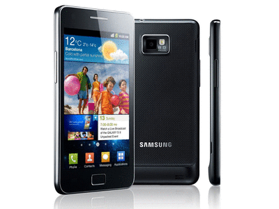
in our trailer we had voice over, and so we decided to use our Samsung s2
phones which has a pretty immense sound recorder. Our phone also has a light
option which gave us the chance to create artificial light such as rapid
flashing. We used this in many scenes such as the part where Ella is sleeping
and the hand is reaching out for her and also where Mary is having distorted
fits.
Our ancillary tasks were edited professionally using top of
the range software, Adobe Photoshop CS5. We took our photos using an SLR camera
to produce high quality images and so when resizing the images, the pixels will
still be great. SLR cameras provide high definition which grabs every detail of
our desired image, also on the camera screen; it provides us the rule of thirds
which makes it easier for us to make the pictures more appealing. Adobe
Photoshop offered us a range of ways to edit our pictures such as we used the liquefying
tool to edit out antagonists face making her look demented and demonic. We also
used dafont.com to get fonts that will suit our horror movie and our ideas for
the magazine. I have been a user of photo shop for a number of years which
allowed me to expand my skills and also teach my team members cool tricks to
make the image more effective. I can personally say my skills have gotten
better and I feel like I could produce a high quality media text in a limited amount
of time. By applying the rule of thirds, it allowed us to make our poster and magazine effective since there are certain areas where the target audience are most drawn to. The western eye is mostly drawn to the top left hand corner since that is where they would read and write from. This is generally the most eye catching area for our audience. The power points are the most effective areas since they tend to stand out the most. We applied this on our work by doing it to our main poster and magazine. We placed our main image on the power points since its the audiences main focus. we placed sell lines at certain the top left power point since it would spread about the top area where they would read first and also the centre which is the most eye catching.

In relation to our trailer using media technology, as a group
we struggled at first but as time went on we discovered different techniques to
edit our trailer to the best of our abilities. We firstly used Adobe Premiere
Pro CS4 which made us convert all our footage. This caused them to lose some
quality and so we decided to upgrade at CS6. We converted our videos online
from MOD to AVI files. However, during the process of making our trailer, Adobe
Premiere pro kept breaking down and refusing our files so we decided to use the
software Sony Vegas Pro 11. Sony Vegas Pro is the most amazing software for
editing. It made our trailer so much easier to edit as for it was really user
friendly, for some things we didn’t understand we googled some things such as “how
to fade” which gave us an insight of how to use this software. We used a range
of transactions of fades, cuts, editing the lighting, enhancing sound and even
overlapping sound. This program was a sensation and I could say that my skill
in movie editing has improved to a high extent. For audio and sound effects, we
downloaded videos from YouTube and converted them to mp3 files. I used a programme
called audacity which allowed me to remove voice and dialogue from background
music. we applied this software to the grave encounters trailer as for the tensional music
matched well with our scenes. At first the process was really uninviting and
very complicated when using Adobe Premiere Pro, but Sony Vegas was a real
confidence boost and we felt as if this program helped us achieve a successful trailer.


Vegas Pro allowed us to edit certain clips such as speeding them up. This is done where our antagonist reaches to Ella when she is asleep. When Mary is having a fit, we decided to also make it faster as it created the sense of un-human actions. it provided the audience with fear since they know that it doesn't occur in their everyday lives. Obviously when filming, we had a lot of extra waste of footage so we done many cuts and edits to get what we want to be achieved. The most common effect that we used on our trailer was fade in and out. This allowed a smooth transition between each scene and so it created that narrative feeling. at one point we used effects like audio boost, muting sound, a range of audio files playing at once. Through going on YouTube and looking at tutorials, I learnt how to flip the video which was used on our sting. This was an effect that created the unusual and demonic feeling. This is a preview of how the original recording was edited to be used effectively in our trailer.
Here you can see that Sonia is messing about trying to get into the mood of the shot, its clear to say we cut out a lot of unnecessary footage which shouldn't be in our trailer.
Finally for our post production evaluations, we decided to be
technical and use online surveys where we then emailed our target audience the
link so they can answer the questionnaire that we provided. Our online survey
allowed easy organization and allowed it to be visual which of course makes it
fun for our target audience. At some points we voice recorded some "on spot" feedback where we showed our audience our ancillary tasks and they then quickly commented on what they thought. We also filmed reactions and responses for our
trailer feedback so that we can get more valuable feedback and see the target audience’s
reactions. I feel as if we used enough media technology for our media coursework
overall and we have supplied a range of methods and technology across our work.

Overall, we managed to satisfy our target audience needs and expectation by creating these 3 pieces of media text. I feel that all the research and planning that we done helped us achieve the best standard of media texts. I can personally say that I enjoyed our time creating this promotional package as it challenged and helped me organize myself since we had such a tight deadline. It was a thriving challenge that me and my group completed and it was a relief when it was all complete.
No comments:
Post a Comment